Logo considerations
Although logo design can be subjective – beauty is in the eye of the beholder after all, there are several things to consider in establishing a properly designed, practical and presentable logo.
Creativity, taste, technical suitability and psychology all come into play when designing a suitable logo for your business. Whilst almost ‘anything goes’ within reason, there are a few guidelines that should help you achieve a great design – while avoiding the many pitfalls that can cause headaches or even harm your business image.
What should my logo look like?
A great logo can ultimately make the difference between a deal or no deal.
Often the first item of media your customers encounter, your logo should convey a level of trust, credibility and professionalism to create good first impressions. It can also be effective in a variety of ways such as being very memorable or a visual trigger to reinforce the nature of your business or even just portraying credibility with a crisp, clean well designed look that asserts expertise and reliability. A badly designed, illegible or amateur looking logo can put customers off when comparing products or services from competing companies.
- Logo Type
Although there are a multitude of logo categories, they boil down to 3 basic types : Wordmark, Symbolic and Combination
WORDMARK
Text only. Very legible, crisp and effective.

SYMBOLIC
A stand alone symbol or icon.

COMBINATION
Usually text accompanied by a symbol or icon.

Unless your business is a multi-million pound established corporation, a symbolic logo should be avoided as it takes years to be recognised as a ‘brand’ and will only cause confusion to potential customers.
Consider a WORDMARK or COMBINATION logo to let clients know who you are simply and effectively.
- Complexity
When it comes to legibility, recognition and good print reproduction, a great starting rule is ‘KISS‘ – Keep It Simple, Stupid. The more complexity that is introduced to a logo, the greater the chance of confusion and print reproduction difficulties.
Another great reason to keep your logo simple is longevity; fancy, complicated logos become tiring very quickly.
- Font
The typeface you choose can give an indication of the nature of your business or even the quality of goods or services you purvey.
Fonts can be lively, serious, clean, bold, eloquent or even frightening – but ultimately should be clear and legible and not inappropriate to your business… Comic Sans on a funeral directors sign just doesn’t cut it.
If you have any doubts, a clean sans serif font works well in any line of business.
- Colour
Colour can be vitally important. This implies to lack of, too much, ‘wrong type’ and psychologically appropriate…
…wait, there’s a psychological effect of colour? read on…
Colour Usage
Following our ‘simple is best’ strategy, try to avoid a large range of colours as this helps in print reproduction and legibility. Single colour (even mono / black & white) can be hugely effective and technically superior to a rainbow of mixed colours.
Colour can also cause problems when your logo is seen on similar coloured backgrounds or used on a busy image and must be considered carefully.
While bright colours can be beneficial in standing out from your competitors, neon or ‘ultrabright’ colours should be avoided as they will NOT reproduce in standard print processes due to the differing way ink (pigment) produces colour as opposed to computer screens (light).
Colour Psychology
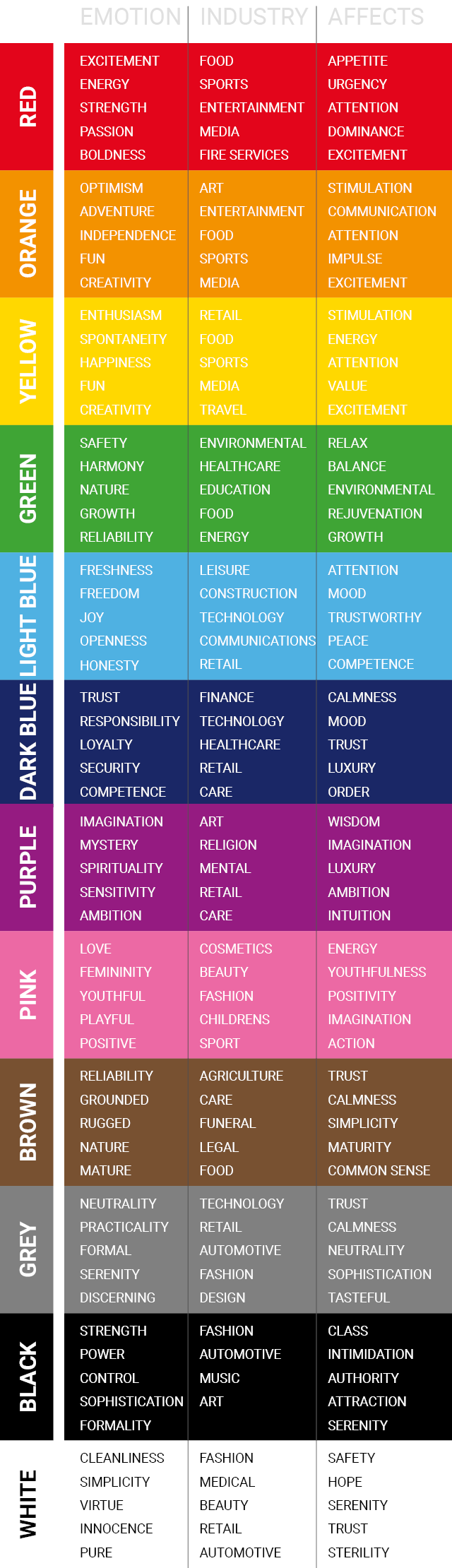
Have you ever wondered why most food companies have red in their branding? It’s all down to colour psychology.
Although there is no hard and fast rule about using specific colours in your design – it’s subjective after all, colour psychology can actually play a large part in our daily activities, from how hungry we are to choosing one brand over another. It can affect our mood and influence our decision making when it comes to buying, so choosing the right colour to appeal to your client base may be more important than you think.
The following chart gives an overview on how colour can influence our choices.
- Proportion
Logo size and proportion may be determined by your business name or accompanying symbol and that’s fine, but it’s always worth considering practical use if you are starting from scratch.
With today’s focus on social media and mobile phone usage, compact designs are more practical and visible on ‘avatar’ and ‘profile’ icons, especially on smaller devices. If you are a heavy social media user, it may be worth abbreviating a long name or stacking words over 2 or 3 decks or moving a symbol to the top or if this is not possible, an alternate design specifically for social media may help.
- Format
JPG? PNG? EPS? WEBP? PDF?… What does this mean?
If you have to keep only 1 logo file, make it a PDF as these can usually be used by any good graphic designer or print house.
In reality, you should have your logo supplied in several formats to suit all media platforms. This makes life easy for web designers, print houses and your office work and prevents that pixelated look showing up on banners or making web pages load slower.
Your logo should always be designed as a ‘vector illustration’ first. This means it can be used commercially on uniforms or banners and scaled up to any size, even the size of the side of a building, without any pixelation or reduction in quality. Only after this should it be converted to other formats suitable for websites or office work.
With your professionally designed logo from NINEDESIGN, you will receive a logo pack with all files relevantly named for ease of use e.g. : ‘Yourlogo OFFICE PRINT.jpg’ ‘Yourlogo WEB-TRANSPARENT.png’ ‘Yourlogo COMMERCIAL PRINT.eps’